
It’s always been fascinating to me how color trends are researched and predicted. Color forecasters look at various aspects when predicting the next year’s trends. Current and upcoming events like an election or the Olympics, technology, current fashion trends, and various other factors help them pinpoint what colors will be seen in architecture, home décor, and fashion.

After attending High Point Market this year, one of the biggest trends I saw was color, lots of color. Recently I attended a seminar sponsored by PPG, all about color forecasting and this year’s color trends. I saw examples of three distinct trends at market, which coincide with three palettes PPG predicted.

The first palette we call Rustic Simplicity, which consists of pigments found in nature. These colors have a vintage spirit and are a blend of both the old and new worlds. Nature is a huge driving force for this palette and the architecture inspired by it, while still having a contemporary and casual feel. Hammered metals, patterned and carved woods, suedes, and stamped leathers make up the materials unique to this palette. Overall this scheme is earthy and understated.


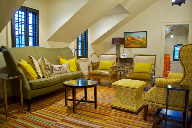
Luminous Hues is the next color trend. This palette is a fresh, bold scheme which mixes dazzling brights such as royal blue, imperial green, citron and Chinese red with softer neutral tonalities. Driven by self-expression and technology, interiors have more of a glamorous 70’s look. Chrome-finished metals, dimensional wood paneling, and metallic patent leathers are the perfect companions to this eclectic palette.


Finally Soft Serenity is the antithesis of Luminous Hues. A soothing, soft, inviting scheme of azure blues, lavenders and blushes with accents of dark gray and black to anchor the ethereal spirit. This palette offers an escape and refuge from the fast pace of life and promotes balance and peace. Austere, quite spaces are created with accents of satin brass, bleached driftwoods and floral prints. Subtle, harmonious spaces best describe this tranquil palette.


No matter your style one of these color palettes will be perfect for you and your home. Don’t be afraid to change up your color scheme or add a new color to the mix!
